top of page
Product Overview
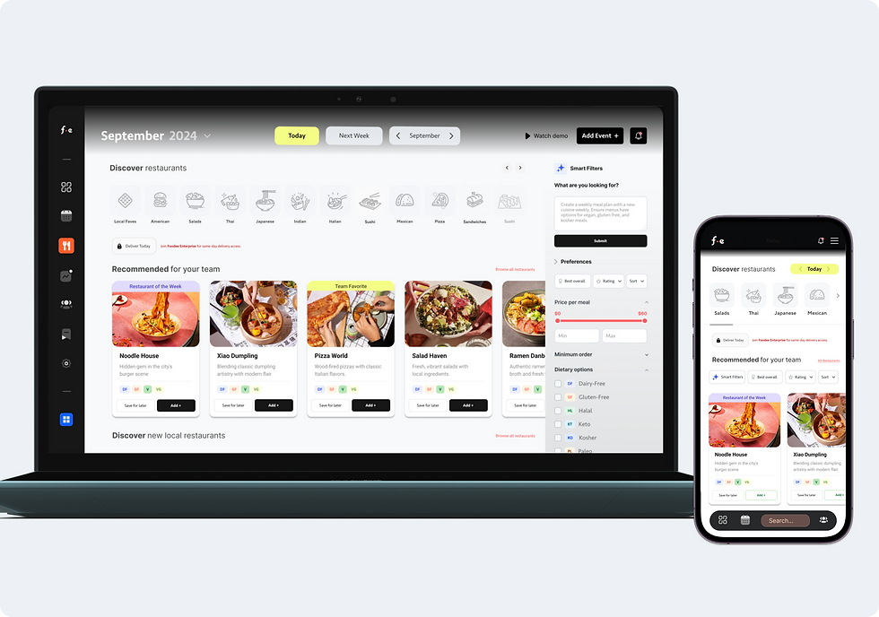
Foodee supports workplace meal programs for hybrid and in-office teams. Office admins set meal schedules, budgets, and deadlines, employees pick meals that fit their preferences, and decision makers get visibility into usage and cost. The product combines restaurant discovery, smart filters, calendar-based planning, team ordering tools, and reporting to make ordering reliable and repeatable.
Skills
User Personas
UX/UI Design
Usability Testing
Responsive Design
WCAG compliant
> Design Systems
Key Tools
Figma
Figjam
Photoshop
Hotjar
Google Analytics 4
Heap Analytics

Role
Product Designer (UX/UI), client experience. I led design across discovery, planning, ordering, and reporting, and partnered with product, engineering, and stakeholders to ship and iterate based on data and feedback.
Improved conversion and retention: +18% add-to-cart, +18% completed orders, and +22% repeat orders.
Designed for
Workplace Ops: plan meals fast, keep teams happy, avoid delivery chaos
Employees: choose food quickly within budget and dietary needs
Finance and People Ops: understand spend, participation, and program value
Business Leaders: keep operations smooth across locations and teams

Core workflows
Discover
Browse restaurants and menus with smart filters for diet, allergy, cuisine, and values.
Plan
Set headcount and per-person budgets, and manage one-offs alongside recurring plans.
Coordinate
Run team ordering with clear participation states, reminders, and visible order deadlines.
Measure
Review reporting on participation and spend to make the program easier to justify and improve.


Navigating Complexity
Ordering workflows required balancing organizational constraints, menu logic, and scheduling edge cases. I simplified decision paths through progressive disclosure and clearer system feedback.

Outcome
Partnered with Product and Engineering to test iterations and ship improvements tied directly to conversion.
+105%
Visit to cart
Improved discovery and decision-making with clearer hierarchy, filters, and interaction states from browse to cart.
+5%
Order Conversion
Improved checkout clarity and reduced drop-off with clearer pricing, budget inputs, and guided next steps.
+18% Completed Orders
Reduced friction across the ordering flow so more teams completed checkout successfully.
+22%
Repeat Rate
Improved reporting on participation and spend so teams could measure outcomes and refine future orders.
Key Learnings
Designing for Impact, Not Perfection
Focused on core UX flows for V1—delivering value quickly within constraints.
Framing Design as Business Strategy
Used design to align teams and solve real business problems—not just improve visuals.
Problem → Design → Outcome
Tied UX decisions to ROI and conversion to gain stakeholder buy-in and show business value.
Strategic UX Thinking
Approached UX as a long-term investment—balancing user needs with business goals.


bottom of page