Product Overview
Mount Shasta Escapes is a travel brand and responsive website built from the ground up for curated Northern California getaways.
Travel UX • Hospitality Website • Booking Flow • Brand Storytelling • Responsive Web Design
Starting with only an early proposal, I shaped the brand direction, visual identity, UX strategy, information architecture, and page templates into a polished digital experience. The goal was to make an unfamiliar destination feel inspiring, trustworthy, and easy to book, while giving the client a scalable system for future escapes.
Key Tools
Figma
FigJam
Adobe Illustrator
Photoshop
Webflow handoff
Skills
UX/UI design
Responsive web design
Information architecture
Travel and hospitality UX
Content strategy
Brand storytelling
Booking flow design
UX research synthesis
Visual direction
Developer handoff
Project snapshot
Client: Mount Shasta Escapes
Timeline: 2 weeks
Role: Lead UX/UI Designer, Brand Designer, and Creative Director
Team: Founder, Webflow Engineers
Platform: Cross platform mobile app with tablet support (iOS and Android)
Scope: Homepage, escape listing page, escape detail templates, About page, FAQ, Contact, reservation inquiry flow, brand assets, research, personas, and site architecture
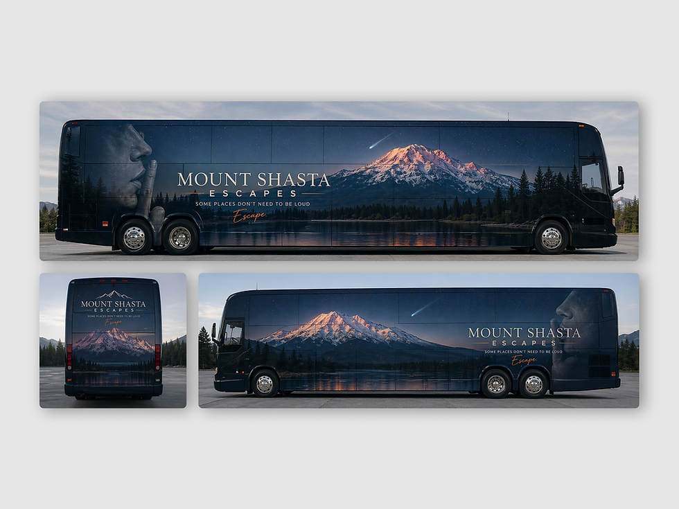
Deliverables: UX research summary, proto-personas, sitemap, high-fidelity UI, responsive page templates, brand guide, logo assets, and developer-ready Figma handoff
My role
I led the project from early concept to launch-ready design, translating a proposal into a complete travel brand and responsive website. My work included brand direction, logo and visual identity, UX research, proto-personas, site architecture, content strategy, high-fidelity UI design, booking-focused page templates, and developer-ready Figma handoff.
The problem
Mount Shasta has strong appeal, but it is less familiar than destinations like Tahoe or Napa. That created both an opportunity and a trust challenge.
Travelers needed to quickly understand what Mount Shasta Escapes offered, why the region was worth the trip, and how the experience would work. The site also needed to make logistics feel easy, especially around transportation, lodging, itineraries, dates, and booking details.
The research pointed to a clear UX challenge: the barrier was not interest. The barrier was friction.

Research insight
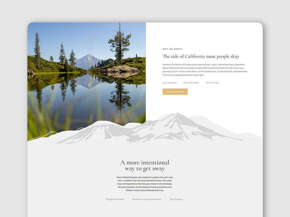
The strongest early audience was not everyone. It was likely urban, time-conscious Bay Area travelers looking for a short nature escape with less planning friction. The research also showed that users would need inspiration and reassurance together, especially since Mount Shasta is quieter and less widely understood than more familiar California getaway destinations.
The proto-personas focused on travelers like Maya, a busy Bay Area reset seeker who wants a beautiful weekend away without piecing everything together, and Priya, an experience-led planner who needs clear details before recommending a trip to others.

Goals
-
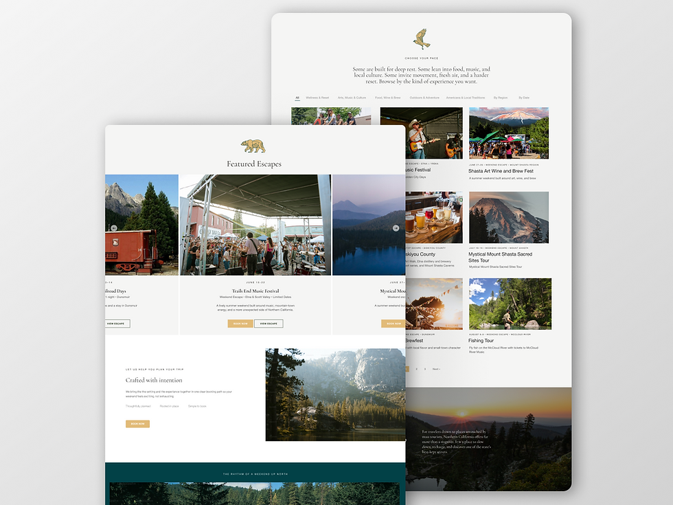
Create a homepage that explains the value of Mount Shasta Escapes quickly.
-
Make an unfamiliar destination feel beautiful, credible, and worth the trip.
-
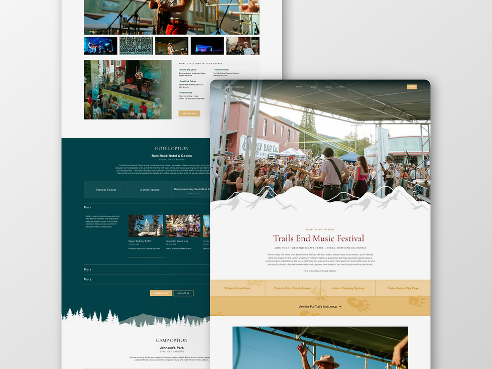
Reduce planning friction with clear inclusions, dates, lodging options, transportation details, and itineraries.
-
Build trust through strong visuals, founder story, FAQ structure, policies, and transparent trip details.
-
Design flexible page templates that can scale as new escapes are added.
-
Create a launch-ready Figma file that could move smoothly into Webflow development.
Key decisions
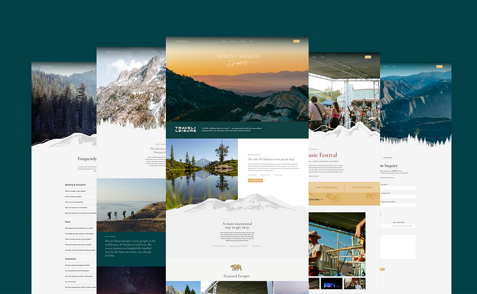
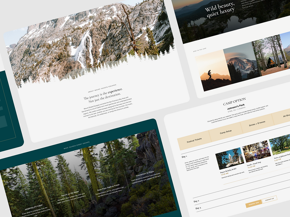
Lead with the feeling, then clarify the offer
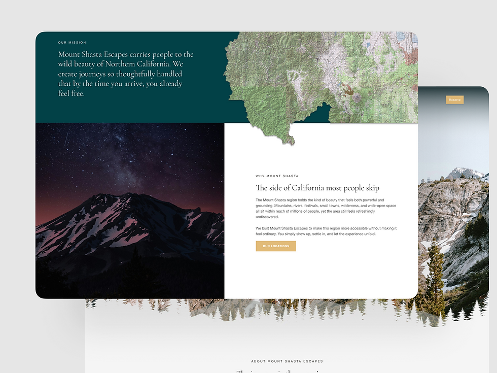
The homepage opens with atmosphere, landscape, and emotional pull. From there, the content quickly explains what Mount Shasta Escapes is, who it is for, and why it is different from a typical weekend trip.
Turn logistics into reassurance
A softer visual system, thoughtful spacing, and consistent tone help the experience feel calm and trustworthy.
Show trends before details
Instead of hiding trip details deep in the flow, I brought high-intent information forward: dates, pickup, lodging, inclusions, itinerary structure, and reservation steps.
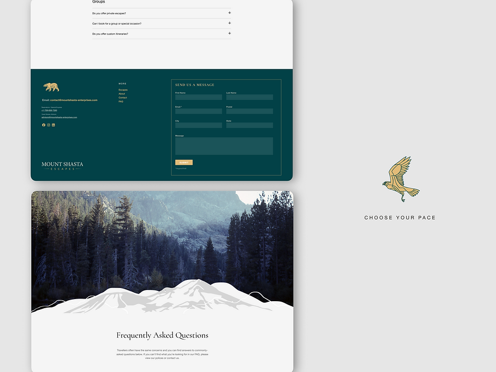
Build trust before the booking moment
Because this was a newer brand in a less familiar destination, the site needed to work harder to feel credible. I used founder storytelling, structured FAQs, clear inclusions, strong imagery, and consistent page patterns to reduce uncertainty.
Keep the launch path simple
For the initial launch, the reservation flow was designed around inquiry and conversion clarity. This gave the client a clean starting point while leaving room for future booking integrations.
Outcome
Delivered a complete launch-ready website system for Mount Shasta Escapes, including all core pages, reusable templates, brand assets, research artifacts, and Webflow handoff materials.
The final experience reframed the brand from a loose travel concept into a clear, premium booking path: inspire the trip, reduce the effort, and build confidence fast.

Next iteration
-
Connect live booking, payment, and availability tools.
-
Add reviews, testimonials, partner logos, and social proof once available.
-
Build clearer sold-out, waitlist, and limited-availability states.
-
Add filtering by date, region, pace, and experience type.
-
Create dedicated shuttle route pages if Mount Shasta Shuttles becomes its own product path.
-
Track homepage CTA clicks, escape card engagement, FAQ usage, and reservation form completion.